Project Overview
Design Challenge
Real estate investment is an increasingly popular way for individuals to achieve financial security. It is an exciting and emotional experience, but often complicated. While there are plenty of blogs and agencies providing information, often, buyers new to the market may struggle to get started without professional guidance and waste time viewing properties out of their range. How can we provide them with the expertise needed to get started efficiently?
Design Goal
Create a responsive web app that provides property buyers with information on properties of interest quickly and easily.
Purpose & Context
This was a personal project that I designed as a part of a UI design specialization course at CareerFoundry to further develop my UI skills in the design process.
My Role
UI/UX designer tasked with incorporating existing UX groundwork with established business goals to further create the final product design of Listed. I was involved in the mature stages of the design process but have included the background information that I used as the basis for my UX design and visual design.
Tools Used
Figma, Figma Mirror, Adobe Creative Suit, Balsamiq Wireframes, Web AIM Contrast Checker, Compressor.io, Angle
Understand
5 W Questions
Who?
This web app is made primarily for new, small-scale property buyers who are looking to invest for additional income or financial security.
What?
This will be a user-friendly, responsive web app containing a database of available residential properties and land, and comprehensive information on each listing.
When?
Buyers will use this tool when conducting property searches and making a decision about where to invest.
Where?
Buyers will use this tool at home or on the go. Users can search for properties anywhere, if they’re logged in on a device.
Why?
Unseasoned buyers need access to reliable, uncomplicated information about their potential property investments. Buyers get a feel for a place by viewing comprehensive information about the property and its neighborhood before spending time on-site.
Persona: Rashida
“I want to provide my family with financial security. I’ve been considering buying property for a while and am looking for a tool that can help me find what I’m looking for, quickly!”
Job Title and Experience
As an IT consultant for a growing tech company, Rashida is frequently on the go, and often holds meetings by phone in her car while driving. She is good at multitasking and relies heavily on technology to help her with this.
Goals
• Rashida makes a good living and wants to invest in property beyond the city for increased financial security for her family.
• She wants to find the right information for fast decision-making.
• She wants a tool to help her find the right properties so as not to waste her time.
Tasks
As she is new to real estate, she wants a tool that is easy to use and that will help her find the property she’s looking for.
• Search for properties, inputting criteria relevant to what she’s looking for
• Easily view and return to listings she’s interested in
• Receive relevant and comprehensive information about properties
Environment
• Physical: Rashida lives with her family in a city on the east coast and spends most weekends in the countryside.
• Social: She likes hiking with her family and playing basketball with old colleagues and friends from college. A colleague recently invested in property and suggested Rashida look into it, too.
• Technological: As a computer science graduate, she describes herself as highly competent with technology. She is always on top of the latest trends in tech, and always has the latest model of smartphone. She uses online tools regularly to help schedule her work, social life, and communicate with friends, family, clients, and colleagues. The tools she uses are functional, easy to use, and intuitive.
Design Criteria
User Stories
• As a user, I want to create a profile containing all my property criteria, so that I am recommended results most relevant to me.
• As a user, I want to be able to search and filter properties, so that I can find good matches based on my needs.
• As a user, I want to be able to save or mark properties I am interested in, so that I can easily revisit them.
• As a user, I want access to as much written and visual information as possible about properties I’m interested in, so that I can make an informed decision.
• As a user, I want to be able to contact the right people if I am interested in viewing a property, so that I schedule a viewing.
Feature Requirements
• Sign in, create user profile, and input property criteria
• Search and filter available properties
• Access comprehensive information about a given property (e.g., specs, value, previous sales, location, 360° visuals, etc.) and its neighborhood
• Bookmark a property listing
• Property recommendations feature
• Ability to contact real estate professional when wanting to move forward with a property (i.e., guided viewing, ready to invest)
Partial Branding Guidelines
• Key Messaging: “Finding the perfect property shouldn’t be hard”
• Style: Clean, quick, smart; greens, blues, purples
User Flow
This is the stage of the design process where I began my design work. Taking one of the user stories, I created a user flow to get an initial idea of the information architecture and user experience.
User Story: As a user, I want to create a profile containing all my property criteria, so that I am recommended results most relevant to me.
Prototype
With a basic user flow fleshed out I began the prototyping process using the best practice of a mobile-first approach. Keeping my persona, Rashida, and her user stories as my guide I created a prototype of low-fidelity wireframes.
Low-Fidelity Wireframes
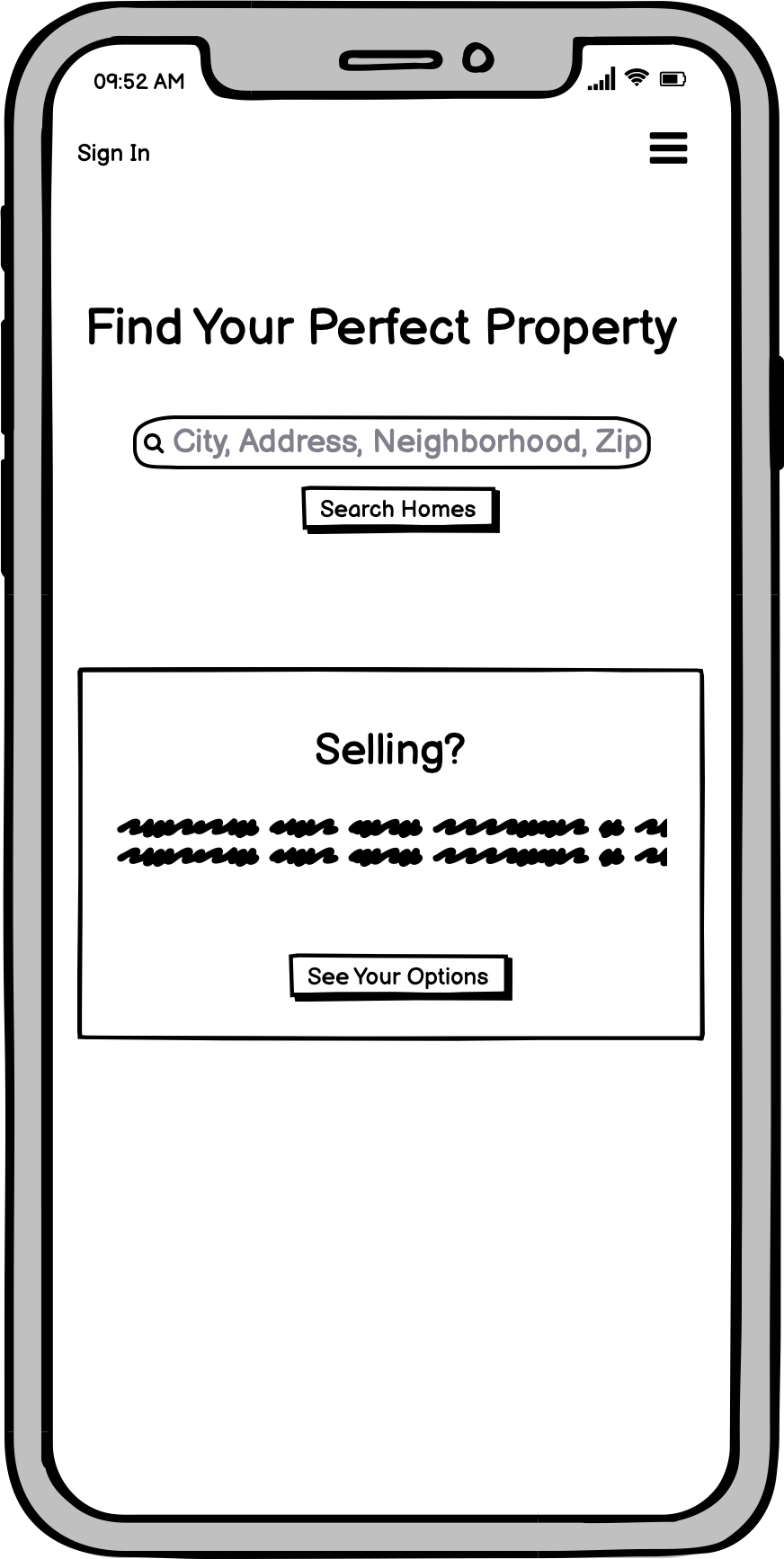
Low-fi Wireframes - Landing Page - Mobile
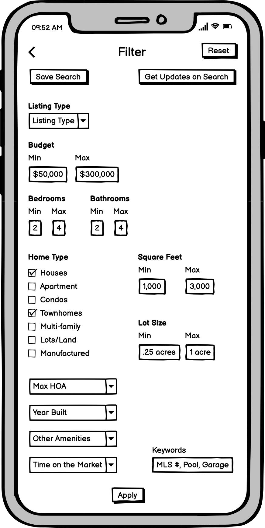
Low-fi Wireframes - Filter - Mobile
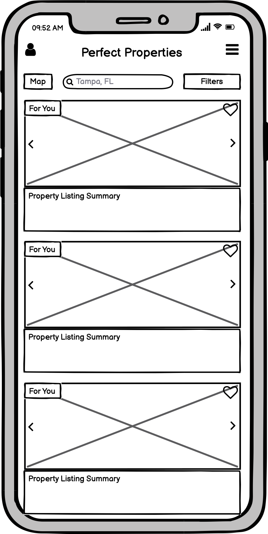
Low-fi Wireframes - Listings Page - Mobile

Low-fi Wireframes - Property Listing - Mobile
Mid-Fidelity Wireframes and Incorporating the Grid
After my first pass with low-fidelity wireframes I started to hone in on the layout and grid. Sticking to common industry standards I looked to Bootstraps' 12 column grid. This provided a solid foundation not just for my responsive grid but for my development team as well.
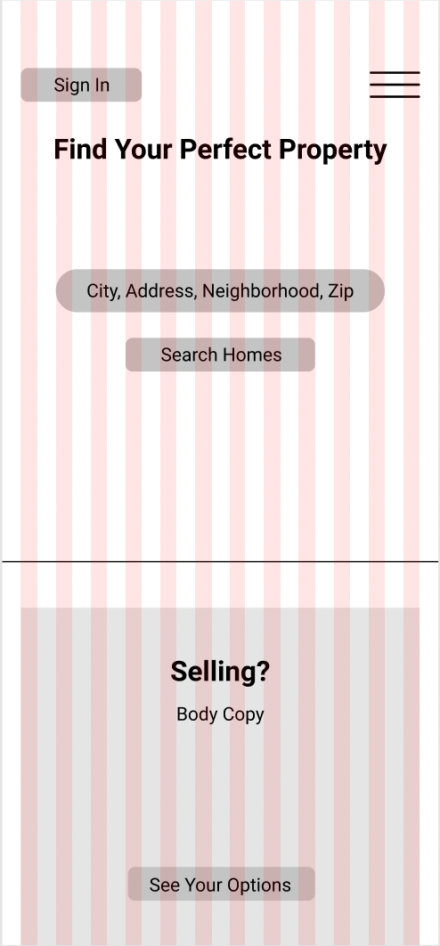
Mid-fi Wireframe - Landing Page - Mobile -Grid
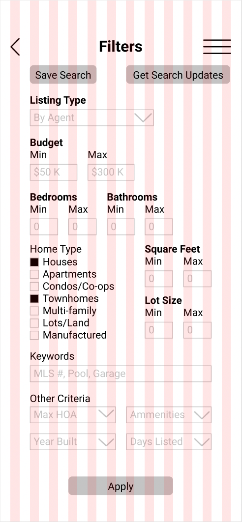
Mid-fi Wireframe - Filter - Mobile -Grid
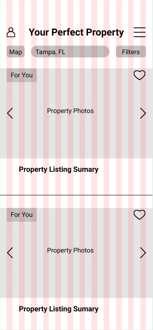
Mid-fi Wireframe - Listings Page - Mobile -Grid
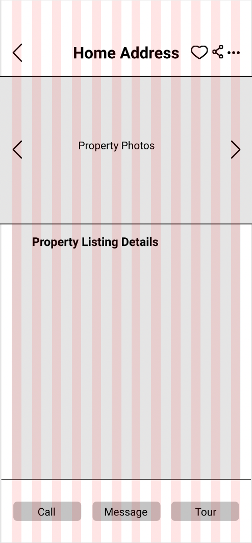
Mid-fi Wireframe - Property Listing - Mobile -Grid
Mood Boards
With my mid-fidelity wireframes aligned perfectly to a 12-column grid I began to establish the visual aspects of my design by creating two mood boards. In my first mood board, Modernly Vibrant, I was striving to meet the partial brand requirements that were mentioned in the project details including greens, blues, and purples. In the second mood board, Minimal Sophistication, I focused more on the user and what they would want visually. Since Rashida is looking for an investment property that told me that Listed needed look and feel reliable and trustworthy to help the user gain confidence. This how I came to the concept of my second mood board and ultimately what lead to the final direction of the UI. After comparing the two mood boards I realized that the first board was too young and free feeling. It also reminded me of Google's branding. Overall, the dark colors and luxurious feel of the second board seemed to speak more to the users' needs and goals.
Lesson: After implementing some of the concepts of the second mood board I realized that some of the luxury home interior images weren't relatable enough for the user. However, by redirecting to outdoorsy images with natural home environments it brought a more casual comfort to the overall visuals.
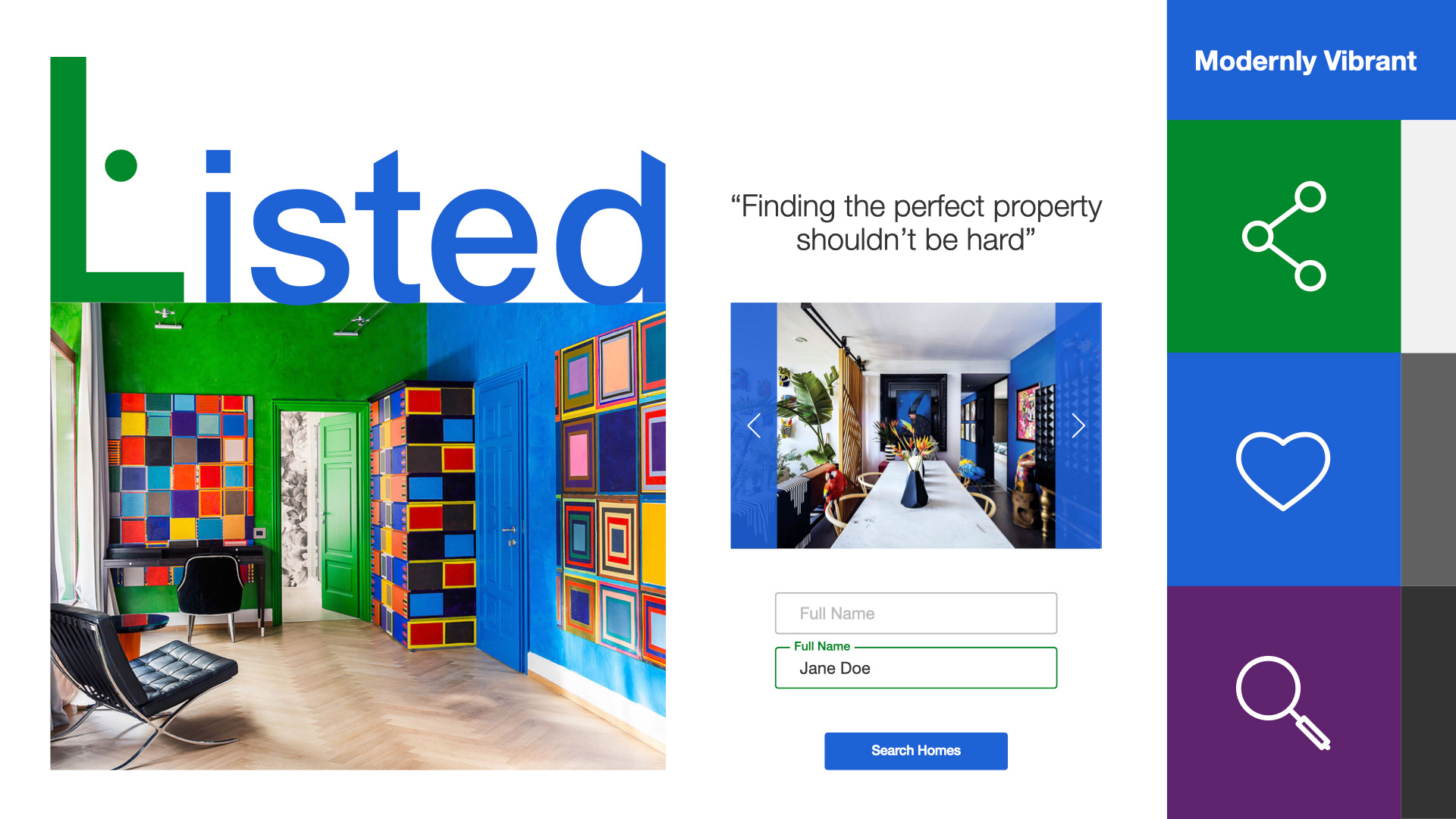
Modernly Vibrant - Mood Board - Listed
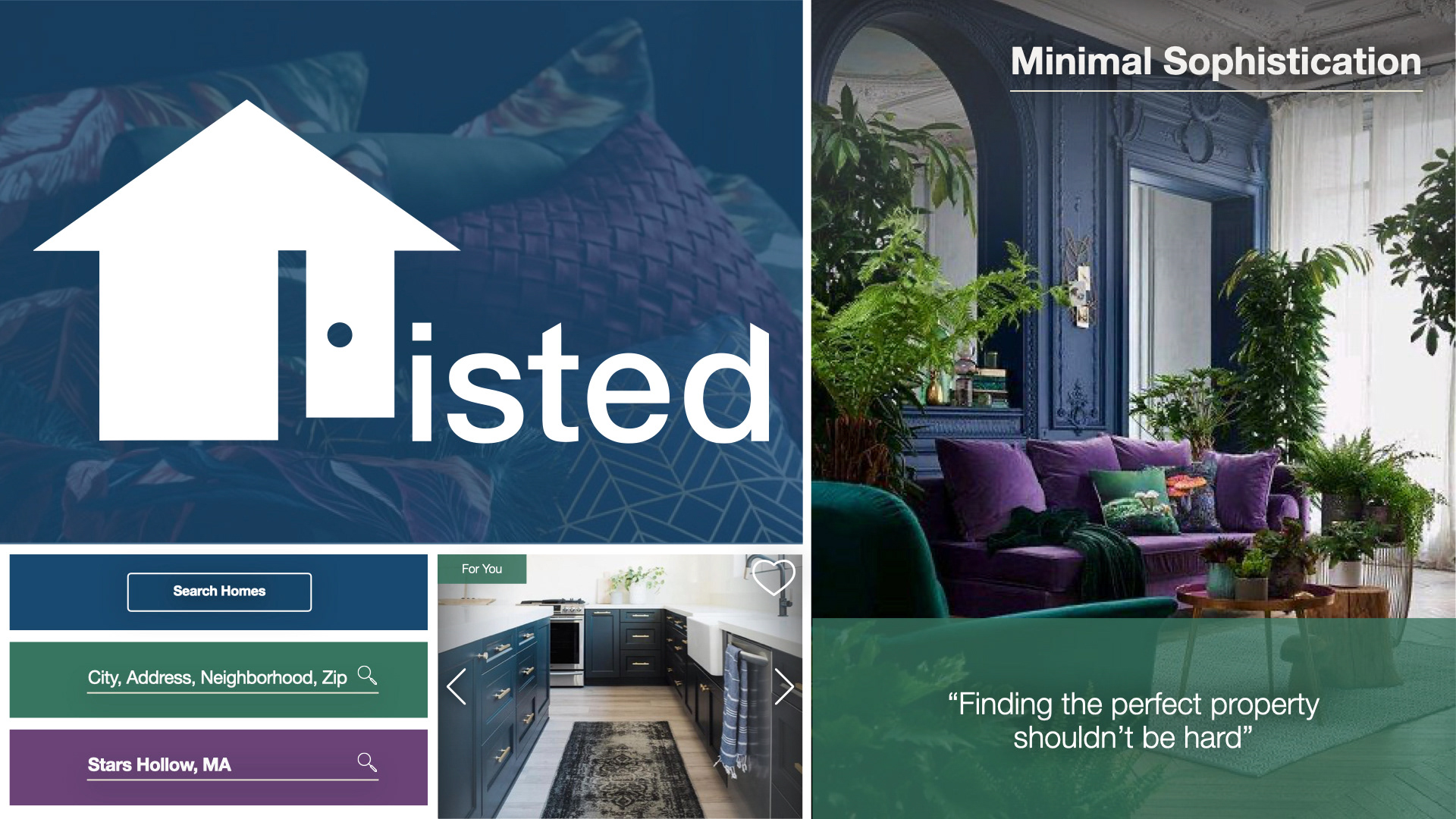
Minimal Sophistication - Mood Board - Listed
Usability Testing
After having the mid-fidelity wireframes put together I conducted usability tests with five volunteers. Their task was to filter and search for a property as a new user. In my results there were two pain points that came up. Below they are listed based on priority.
• Input fields and check boxes on the filter page were too small to select making it hard for users to interact with.
• Users weren't crazy about side scrolling through the property photos on the property details page.
Resolutions
With my mood board chosen and results from my usability testing I started to plan out my high fidelity wireframes. I decided to take a more modern approach to the UI.
• Filter Page: Implemented more innovative but familiar UI patterns using sliders, and various selectors to be more intuitive and accessible.
• Property Details Page: Created alternate layout where photos scrolled up and down while the details floated on a card toward the bottom.
Reiterations
High-Fidelity Wireframes
With my mood board aligned to my users' needs and goals I started applying the visual elements to create my high-fidelity mockups.
Lesson: Some of the UI elements that I had created for my mood board did not quite translate to the final product. They were hard to read and weren't quite user friendly. After some reiterations I finally found a solution that best fit the user's needs.
Try the Clickable Prototype Below
Animations
Below is an example of the Listed loading page that I created using Adobe After Effects. Like the other UI elements of this product the animation sticks to the same minimal simplicity.
Responsive Design
Determining Breakpoints
After implementing the UI in my high-fidelity prototype for the mobile version of Listed, I expanded the design to to be responsive. This included designing for various breakpoints, which were determined by using Bootstraps' commonly used specs. For my tablet device my break point was set at a width of 768 px and my desktop breakpoint was set at a width of 1152 px.
Responsive Low-Fidelity Wireframes
Even at this later stage I once again began with sketching out low-fidelity wireframes to determine the layout and design of each breakpoint.
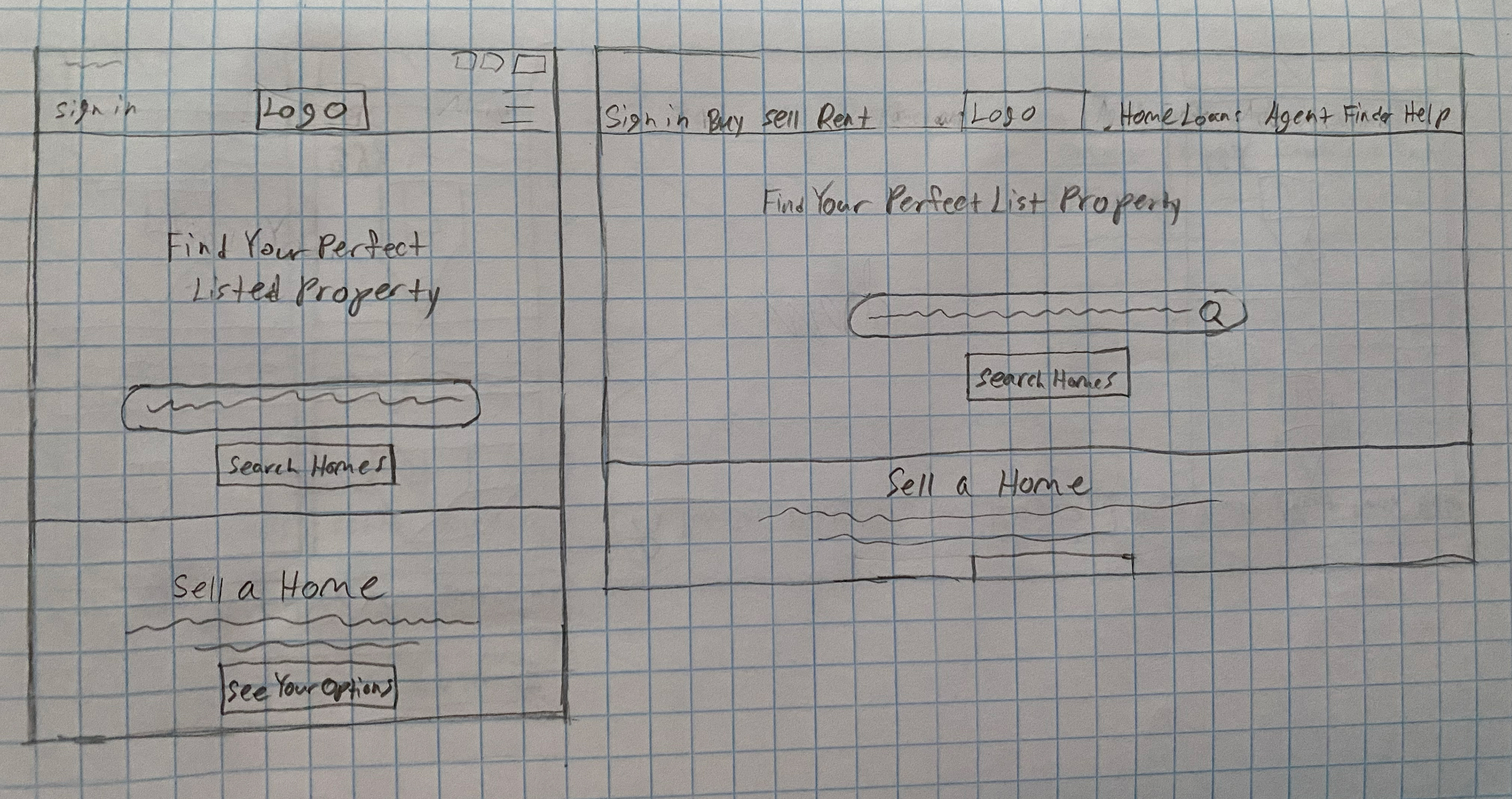
Low-fi Responsive Wireframes - Landing Page
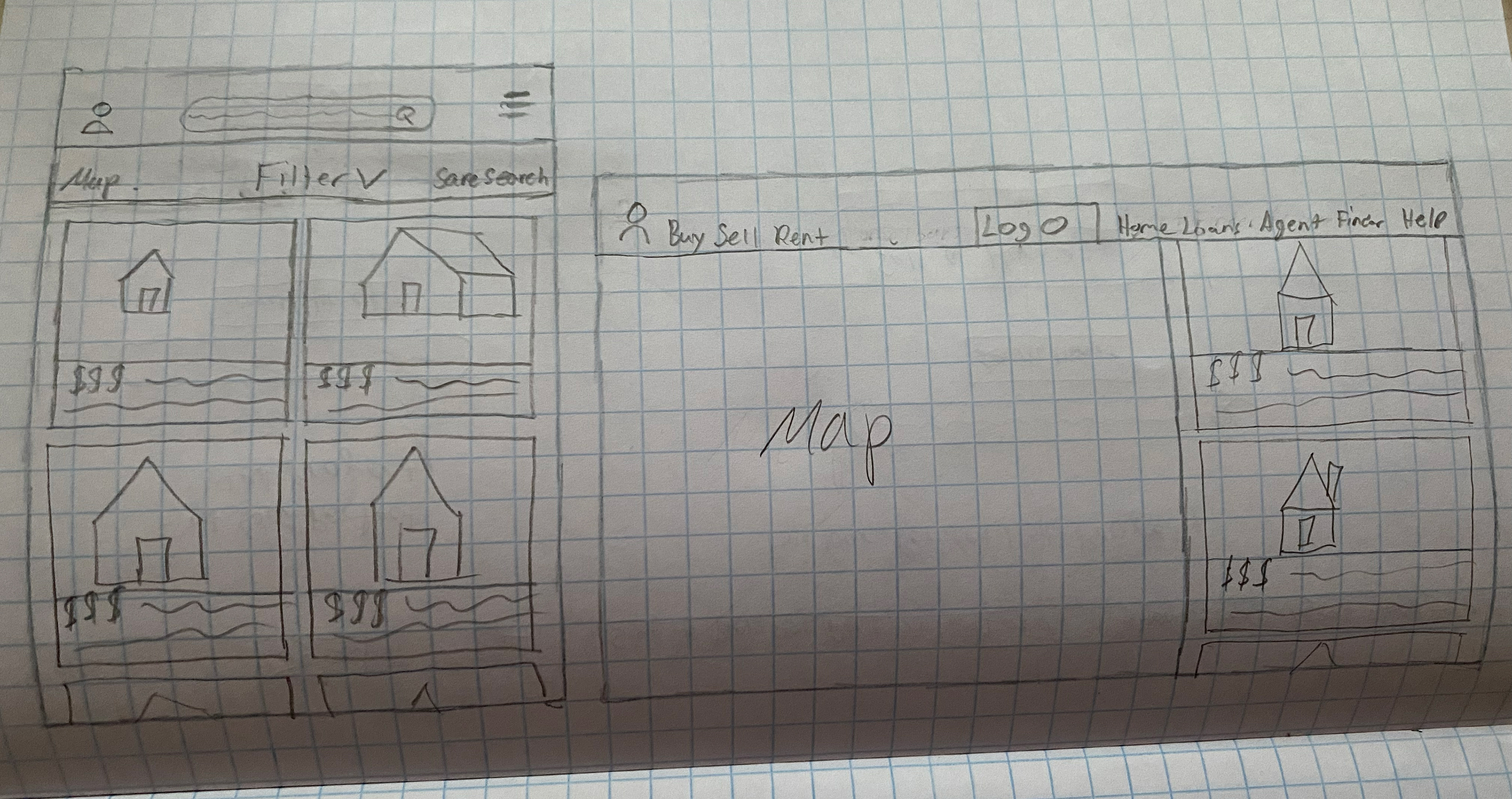
Low-fi Responsive Wireframes - Listings Page
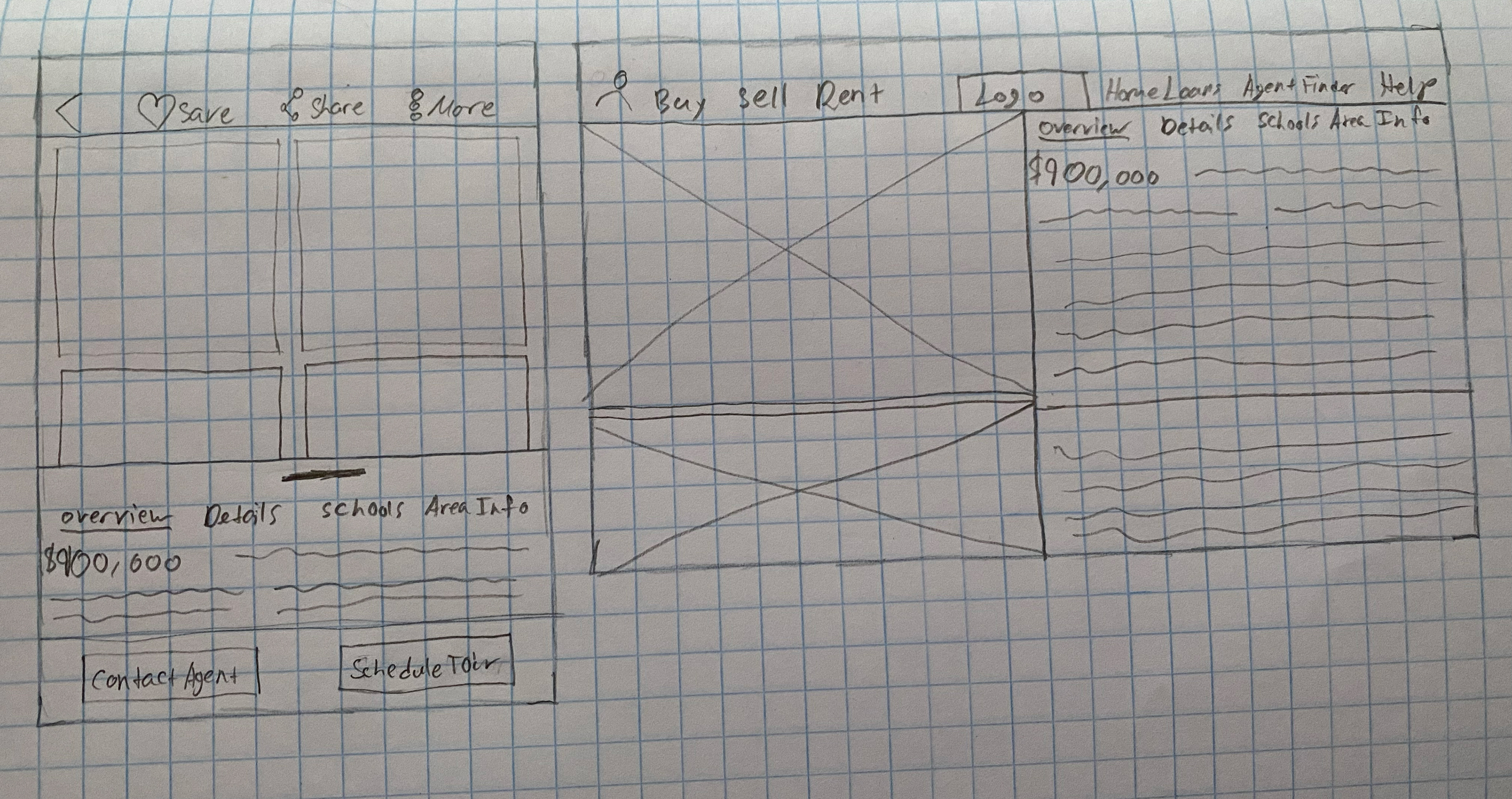
Low-fi Responsive Wireframes - Property Listing
Responsive High-Fidelity Wireframes
With my low-fidelity wireframes flushed out I went ahead and began iterating the high-fidelity wireframes for each break point screen. I chose to go straight to the high-fidelity stage for two reasons. The first, was due to there not being enough time for a set of mid-fidelity wireframes to be produced. Second, was because the UI and visual design had already been established from the mobile version, so it seemed fitting to just apply the UI as I designed the first set of wireframes.
Lesson: While it is always important to strive to complete every step of the UX/UI design process, sometimes the time and resources are not available. In the end, while I didn't get to complete a set of mid-fidelity wireframes, I felt like it wasn't a great loss especially since the foundational work had already been developed.
Preparing for Handoff
Style Guide
With my responsive high-fidelity wireframes created, I prepared my design deliverables for the development team. This included a style guide that detailed the visual elements of Listed. Within this document I provided UI specifications for the logo, typography, iconography, colors, gestures and more. Below is a link to view the full style guide if you would like to see it. I have also included a few examples of the style guide pages along with some of the UI elements.

Style Guide - Typography
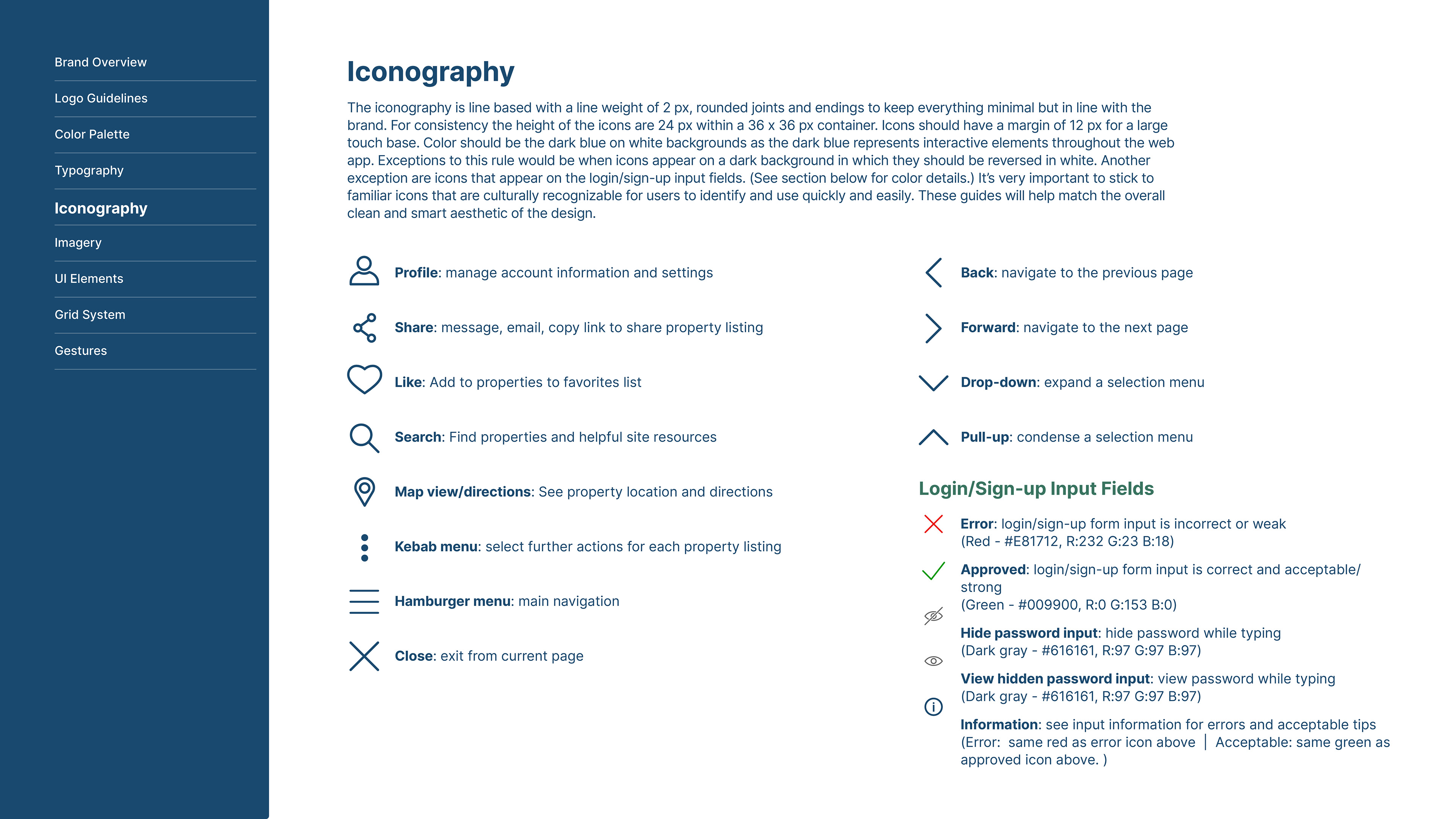
Style Guide - Iconography
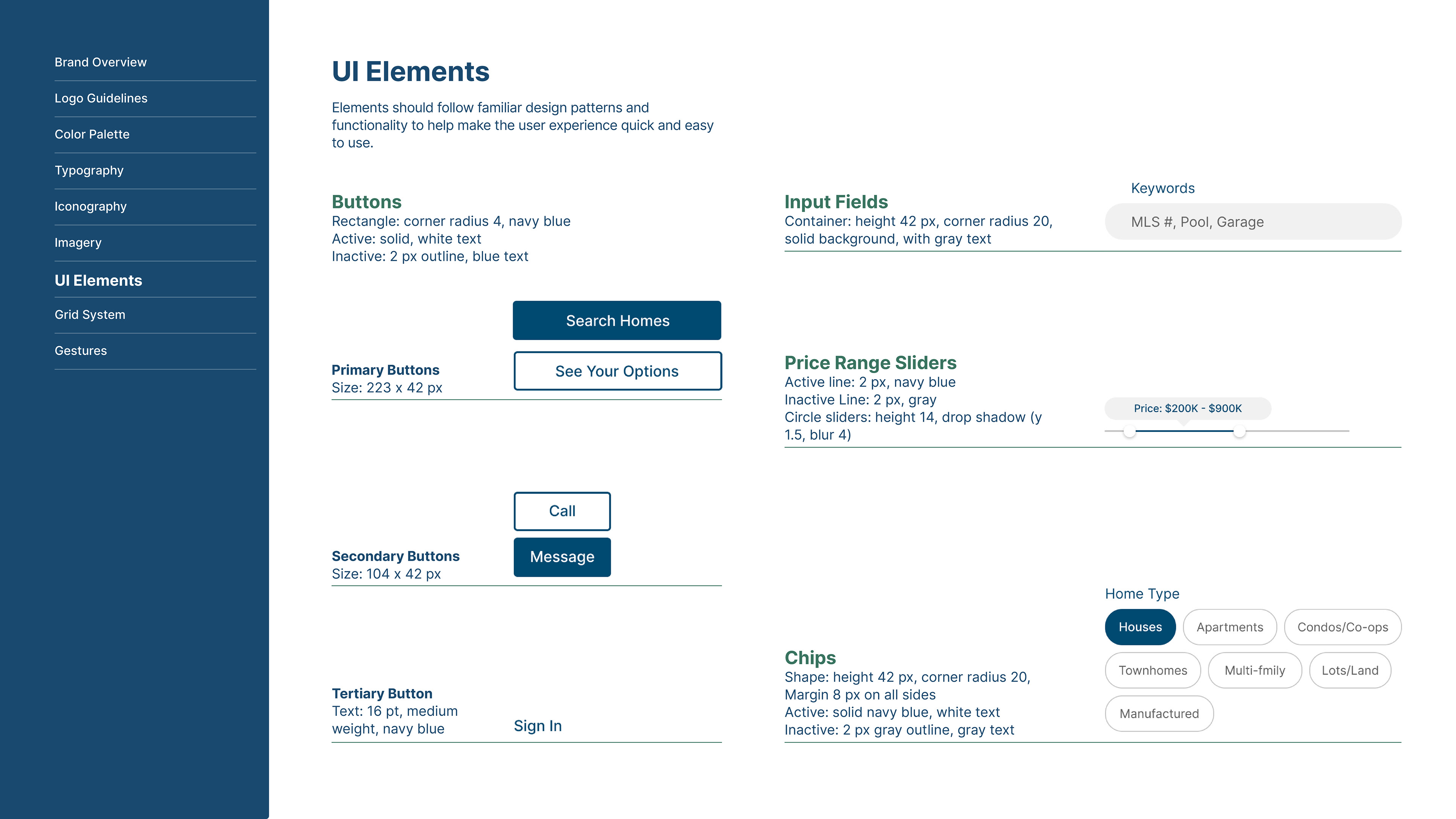
Style Guide - UI Elements
Final Thoughts
Next Steps
1. Conduct usability testing
2. Reiterate based on results and analysis
3. Repeat the iteration and testing cycle until product is ready to be handed off to development team for production
4. Continue to test and iterate until ready for launch
5. Launch with continual maintenance, testing and reiterations throughout the product's life
During this process my main take away is that while design is meant to be a way to discover new and creative ways to problem solve, it's more about marrying familiar patterns with new discoveries. It's through this lens that I view my user and design solutions. My user dictates what new discoveries will help them meet their needs and goals. However, it's the familiar user experiences/patterns within products that brings the full picture to life. Not sure if there is validity in this thought process but I look forward to continuing to learn from the world around me and beyond.
