Project Overview
Design Challenge
How might we design a mobile app that empowers people to learn new vocabulary?
Design Goal
Create a web app that helps establish successful learning behaviors, resources and confidence for students.
Purpose & Context
This was a personal project that I created as a part of a UX design course at CareerFoundry to develop foundational skills in the UX design process.
My Role
UX designer tasked with the beginning stages of the design process including competitive market research, user interviews, information architecture, rapid-prototyping and user testing.
Tools Used
Adobe Creative Cloud, Keynote, Marvel App, Zoom, Balsamiq Wireframes, Microsoft Word
Empathize
As a young student, learning vocabulary was difficult for me and was the lens through which I began the design process. Through competitive analysis and research I sought to discover gaps and opportunities in the market to help lead me to a solution for students today.
Competitive Analysis
The competitive analysis was between three popular vocabulary learning apps Vocabulary, Word of the Day, and Vocabulary Builder by Magoosh.
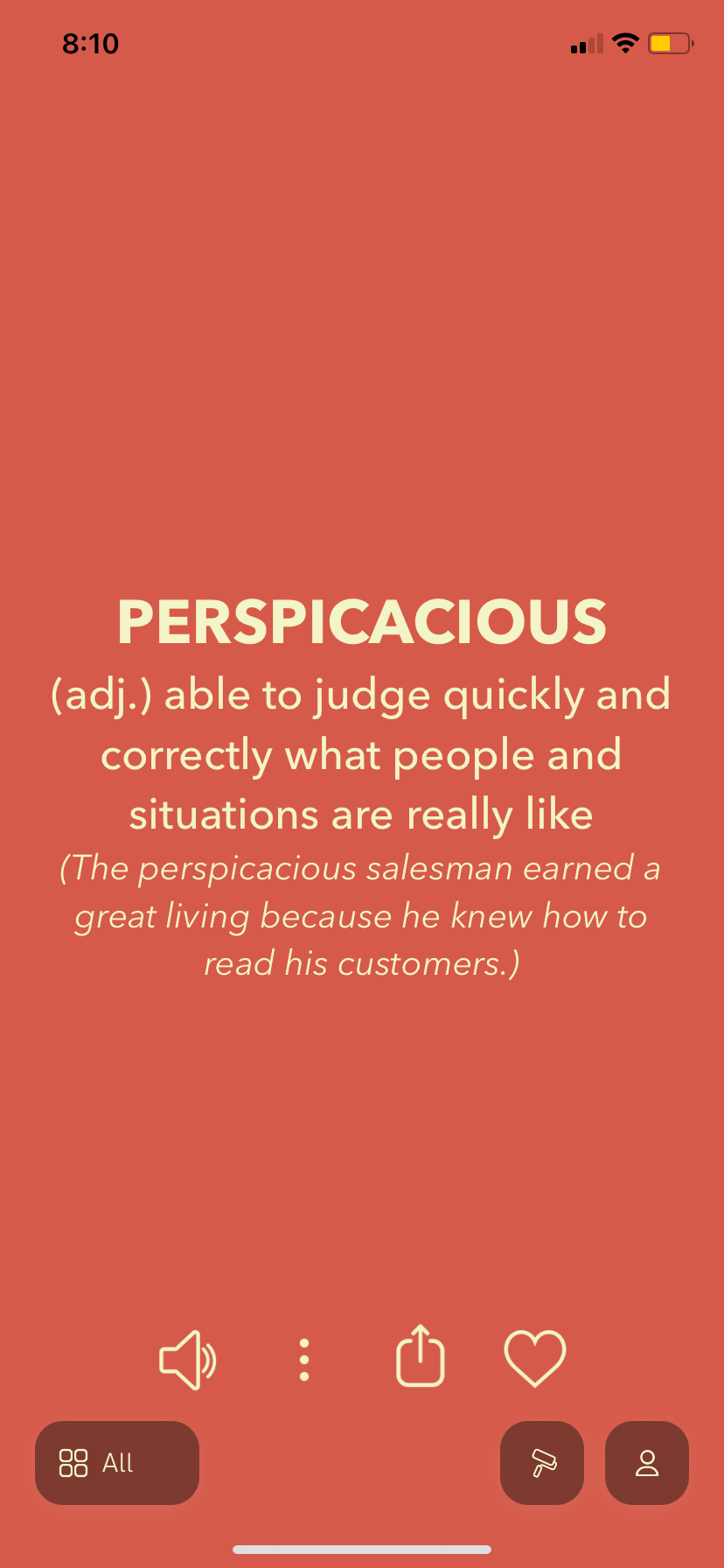
Vocabulary - Definition Page
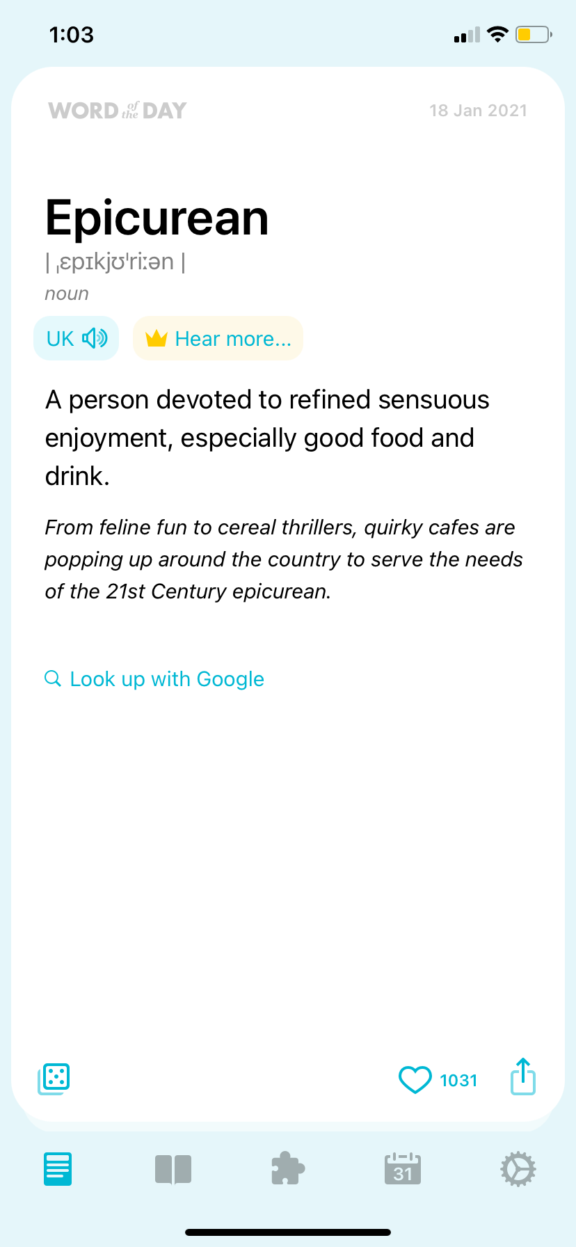
Word of the Day - Definition Page
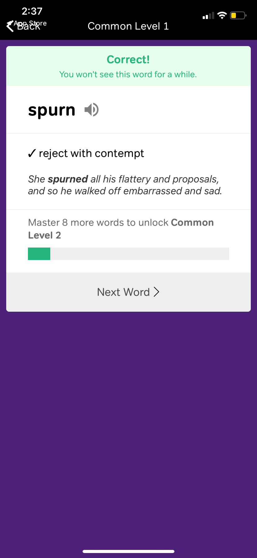
Vocabulary Builder - Definition Page
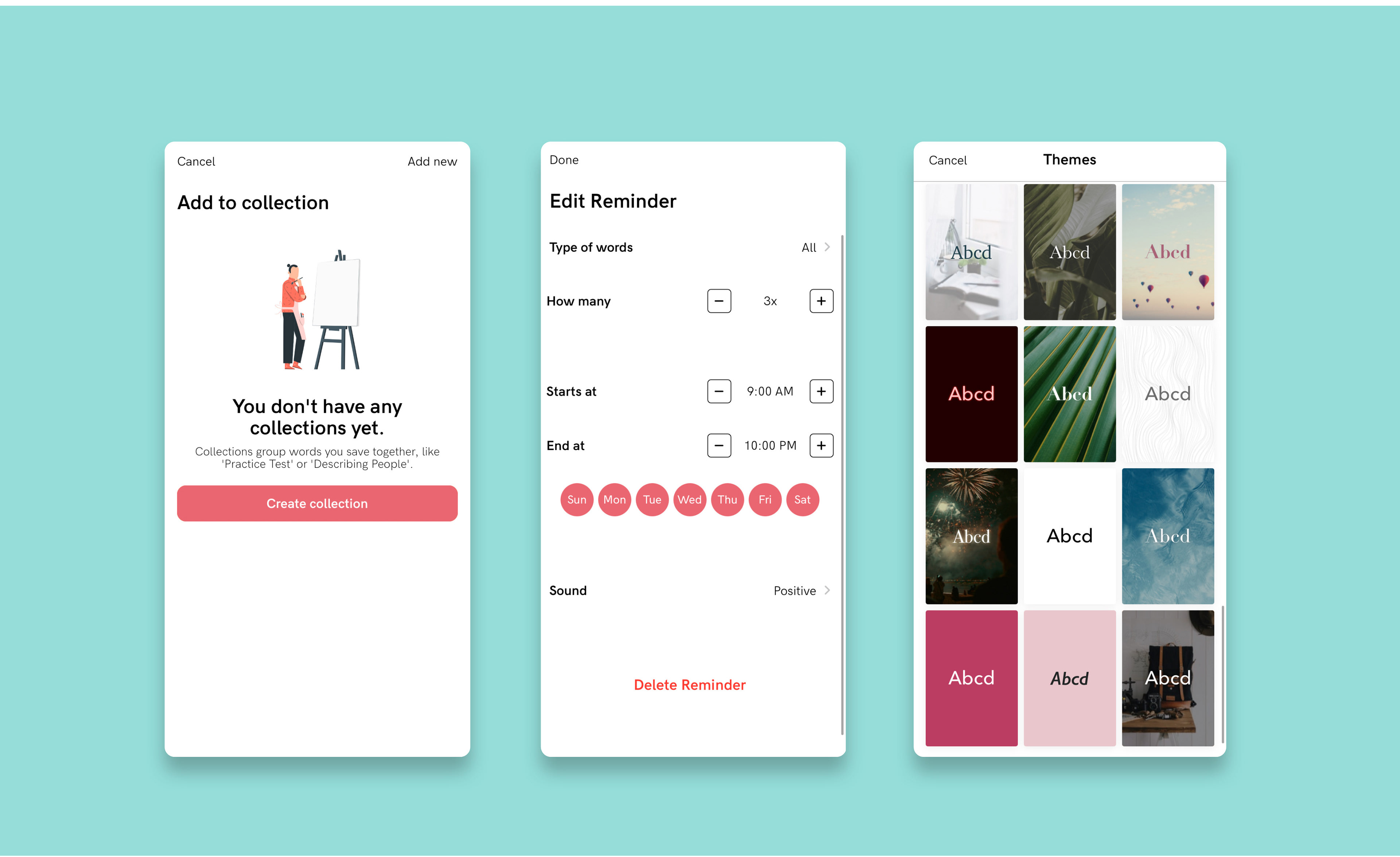
Vocabulary App - Screenshots
Vocabulary
Pros
• The collection section offers a nice organizational feature
• Ability to set reminders with times during the day as well as for specific vocabulary categories and collections
• Sharing capabilities of words/definitions with personalized backgrounds
Cons
• Setting up reminders felt out of place in the onboarding progression
• Finding settings isn’t easy
• Category options are too vague and minimal
• Theme selection is easier to navigate to than adding your own word or viewing your vocabulary collections
• No method for memorization
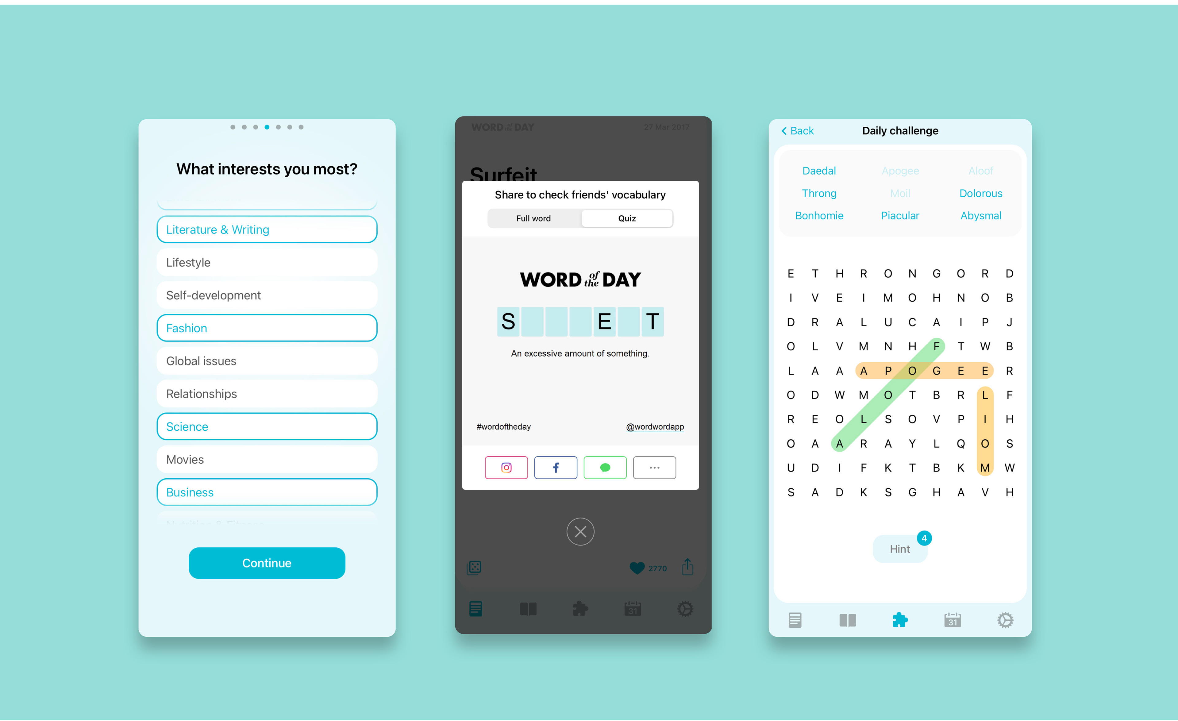
Word of the Day App - Screenshots
Word of the Day
Pros
• Personalization options in the onboarding process
• Ability to post/send a quiz or full word to friends
• Word search puzzle to support fun and active learning
• Advertisements appeared at appropriate times (ex. Viewing the next day’s word)
• Definitions are formatted similarly to other definition sites making them feel familiar
Cons
• The shuffle function of the button in lower left corner in the definition area is unclear
• Visuals are basic and dull
• Voice pronunciation is not always accurate
• No method for memorization
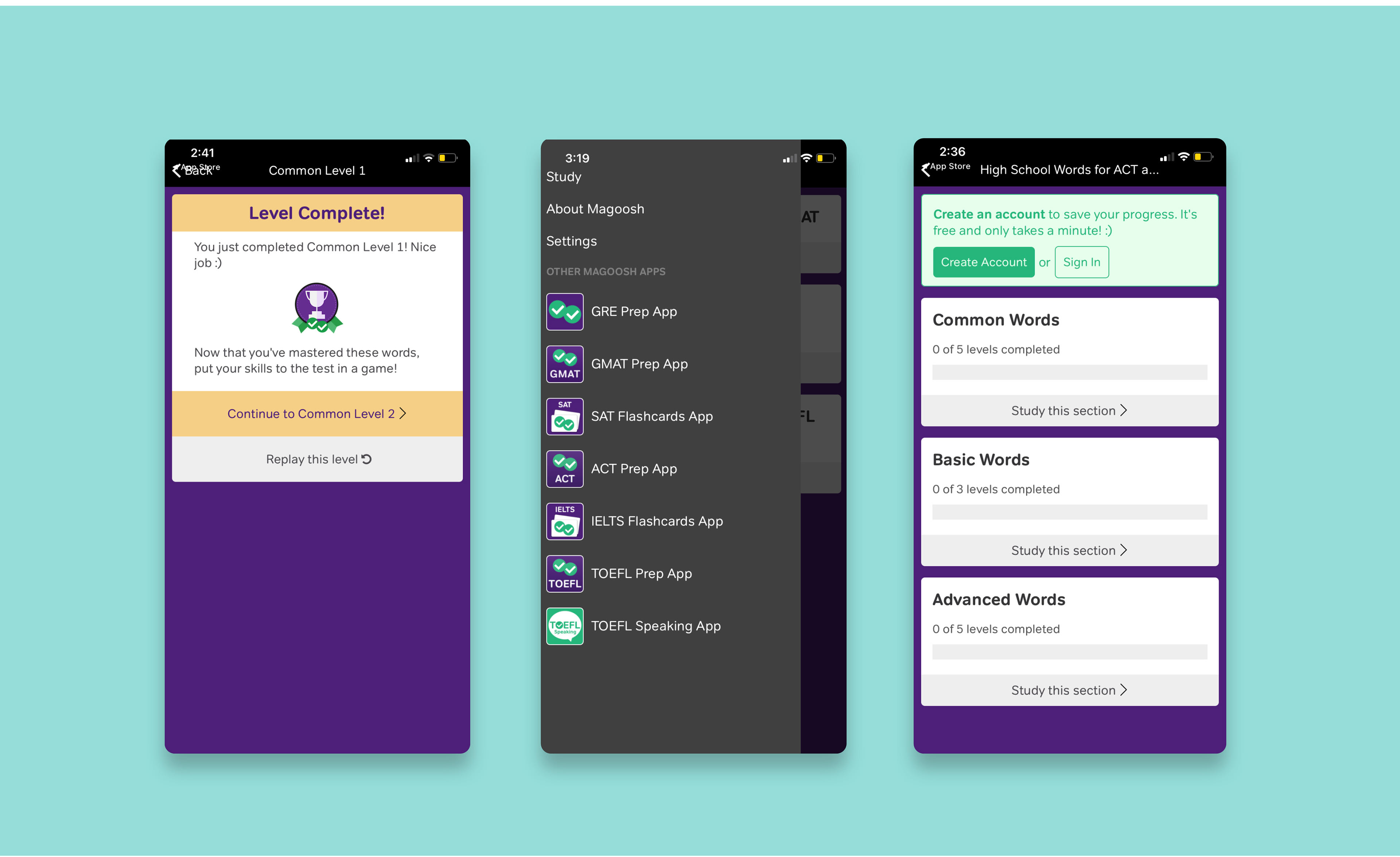
Vocabulary Builder App - Screenshots
Vocabulary Builder by Magoosh
Pros
• Navigation is straight forward
• Repeats words whether correct or not throughout each level for review and reinforced learning.
• Formatted with multiple choice options like a standardized test
• Play someone feature is fun and great for speed testing vocabulary with others.
Cons
• No personalization or customization
• Back button and menu button do not function well, took several pushes to work
• No home button or menu bar after navigating away from the home screen
• Does not offer reminders or scheduled study times.
• No vocabulary list or search opportunities
Define
Purpose
Vocabulary app that helps establishes successful learning behaviors, resources and confidence for students.
Target Audience
Students learning English vocabulary ages 9-15.
Proto Persona, Drew
12 years Old | Chattanooga, TN | 7th Grade
“As a middle school student who enjoys school and learning, I struggle to learn vocabulary. It’s hard to stay engaged when you don’t have the resources to learn.”
Goals
• Reliable resources to search for vocabulary
• Opportunity to practice using the words I learn
• Options for different learning styles
Motivations
• Feels pressure to make good grades
• Likes putting new vocabulary into practice
• Becomes frustrated when the right tools to learn vocabulary aren’t available
Challenges
• Frustrated by not having the resources to find and learn new vocabulary.
• Difficulty in learning vocabulary when the option to listen isn’t available.
• Likes implementing vocabulary but doesn’t always have the opportunity.
• Hard to stay engaged and retain vocabulary.
Drew's Problem
Drew needs a way to learn new vocabulary that is engaging and convenient because as a middle school student he has a short attention span. We will know this to be true when we see successful learning and continued interaction.
Ideate
Task Flows
Task 1 - Signing Up/ Login to the App
Task 2 - Create My Own Definition
Low-Fidelity Wireframe Process
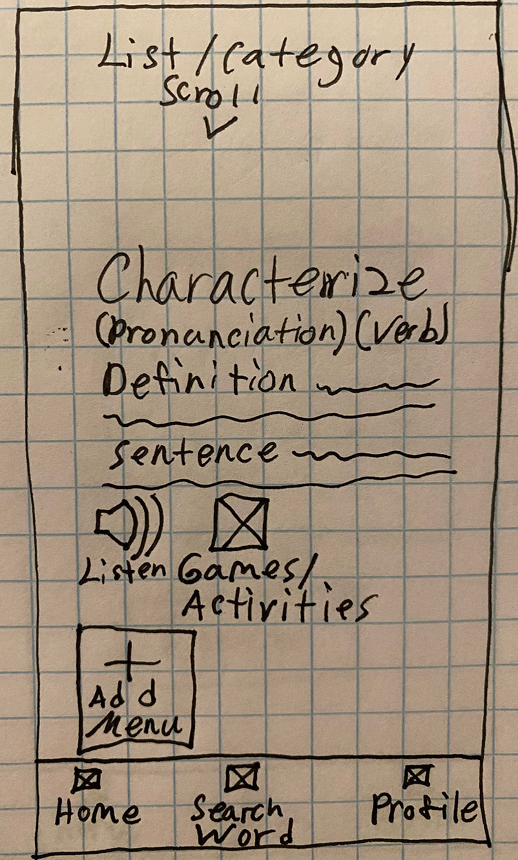
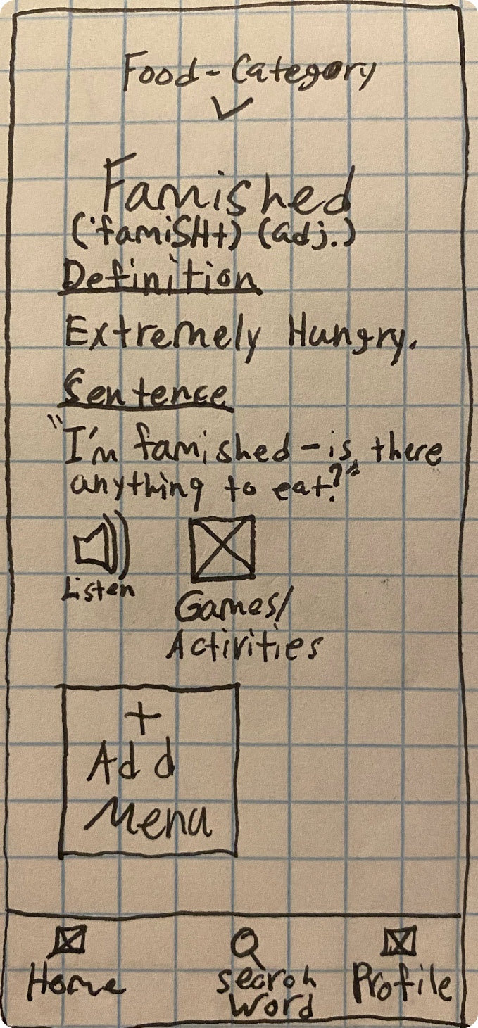
With my research and user flows as the foundation for my design I began to prototype the key features of Vocabulary U. Below are examples of the many low-fidelity iterations I went through before landing on the more refined wireframes. As I went through each iteration I learned from my mistakes and uncovered new solutions for my user. The biggest improvement was seen in the information architecture.
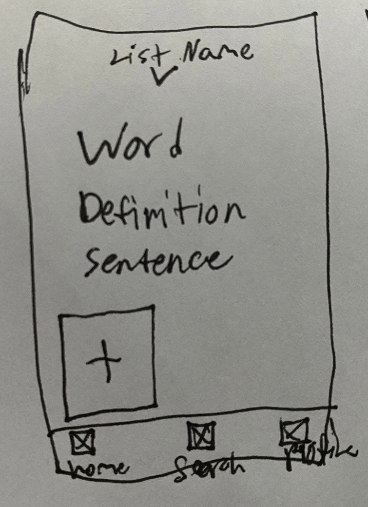
Rapid Sketch - Mobile
Sketches Reiterated - Mobile
Refined Low-fidelity Wireframes - Mobile
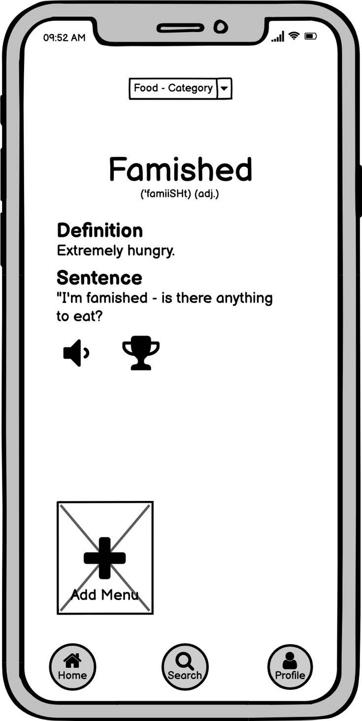
Digital Low-Fidelity Wireframe- Mobile
Working Through Early Wireframe Iterations
Coach Mark Design Issue
Problem
No coach mark for the add function.
Solution
Create coach mark describing the add function.
Onboarding Design Issue
Problem
The initial word search screen looked like a tutorial rather than an onboarding screen.
Solution
Made it match to the other onboarding screens.
Prototype
With my low-fidelity wireframes fleshed out for the most part, I put together a basic clickable prototype using Marvel App.
Usability Testing
With the first set of low-fidelity wireframes designed consisting of only the key features I began conducting usability testing to make sure my designs were headed in the right direction.
Scope
Conducting usability testing for onboarding and learning features of the Vocabulary U application.
Schedule
January 26, 2021, remotely via Zoom
Sessions
10-15 minute sessions with 3 participants to try and catch the most prominent user issues.
Equipment
Testing iPhone 11 prototype via marvelapp.com through shared screen on Zoom.
Metrics
Jacob Neilson’s Error Severity Rating (0-4)
Direct Tasks
Task 1. Sign up and login as new user
Task 2. Set study reminder
Task 3. Search for your first word
Task 4. Add your own definition
Test Results and Improvements
Using Jacob Neilson's Error Severity Rating I determined there were two pain points that needed to be addressed.
Onboarding Menu Button - Severity Rating 3
The highest priority problem was on the onboarding screen for the add menu button. Users kept wanting to push the add button rather than the next button to advance to the next screen. The solution was simple I just removed the next button and made the add button flow to the next onboarding screen.
Word Choice "Personalize" - Severity Rating 2
The second problem was minor but focused around the word “personalize.” This problem reminded me that the user has to be your number one focus behind every decision. Here’s why: One user didn’t even know what the word "personalize" meant. Not a good start when your app is suppose to help make learning easier, not more frustrating.
Solution
Create Vocabulary U, an app where students can easily search, learn, and practice vocabulary for classes or self learning in a fun interactive space. This product will offer various resources, accessibility options and engaging UI for all learning styles and goals.
Final Thoughts
Next Steps
1. Mockup mid-fidelity wireframes
2. Repeat usability testing and editing process to refine
3. Create high-fidelity wireframes and prototype
4. Test high fidelity prototype
5. Reiterate and prepare for handoff to development team
6. Work with development team as application is produced
7. Test, edit and repeat
Reflection
Though this project ended in the prototyping phase I learned how vital the developmental stages are in the grand scheme of design. Establishing the foundation of a products design is both daunting and rewarding as it determines the entire projection of the product. One interview question or user story can alter a complete design outcome. Through this project I developed a user first attitude, which is the most important characteristic of being a user experience designer. I truly loved this process because it gave me the ability to connect with a group of users that I wouldn't normally get to interact with and also learn from.

